33 Polka Dot Quilts
Click on the images to see full slides.
Go to Black
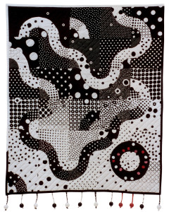
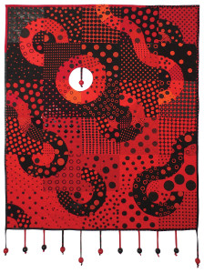
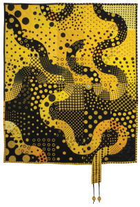
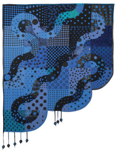
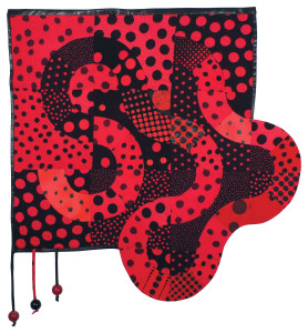
When I began the Polka Dot series, the first few quilts focused on a primary color plus black.
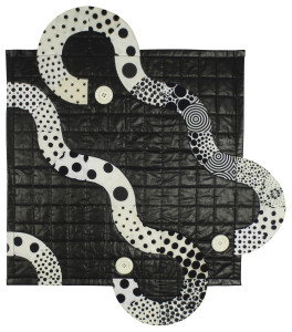
In Mary Mashuta’s workshop, “Lotsa Dots,” my challenge to myself was to use some of the dozens of black and white dot fabrics I had been collecting for a decade and to combine them into a coherent and merry piece. Even with my big selection of fabrics, I ended up having to “make” some of the dots to get the effect I wanted. The wooden balls seemed a natural extension of the dots, tumbling off the surface. I had to buy plain wooden balls, drill out the hole to make it large enough to thread a thong through, and then paint them. I thought the knot at the end of the thong would hold the balls firmly in place. Then a visiting child admired the piece and pulled one off. Now they are firmly sewn in place with clear filament thread.
A collection of French quilts at the Pacific International Quilt Exposition liberated me forever from conceiving of quilts as flat, rectangular, or uninterrupted. Obviously, fabric stores do not stock a dozen red fabrics with different sized black dots and a dozen black fabrics with different sized red dots, so I again had to “make fabric.” I did this partly by over-dyeing black and white dots, but principally by creating a set of 24 silk-screens with different sized dots which I used for most of the fabrics in my subsequent dot quilts. Also, some dots are fused and some are embellished buttons.
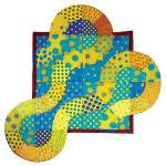
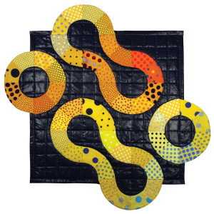
Much over-dyeing and silk-screening was needed to produce these yellow and black dots. I had planned to decorate this piece liberally with yellow and black wooden balls, but in the end decided that two would do.
The final major addition to the black plus color series. I abandoned the rectangle.
A small study, primarily using reject fabrics that I had tried to dye red with Procion dyes for Ball One. The fabrics insisted on coming out 1940s Dubarry pink, probably due to some poly content, dictating their destiny in a different quilt.
Carnival
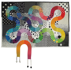
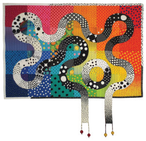
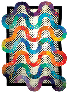
By now I had acquired a large selection of dots, arranged by color into mini-rainbows in plastic bins. They dictated that the next polka dot quilts should replicate the rainbow. The two “Going Dotty” quilts are the first and only quilts in the series made entirely of commercial fabrics.
The two “Going Dotty” quilts are companions, but not mirror images. Going Dotty I starts with an ombré black and white background with colored arcs moving through it.
This quilt reverses the coloring, using an ombréd color background behind the path of the black and white arcs.
Convergence
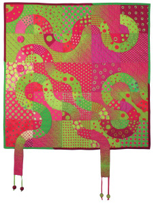
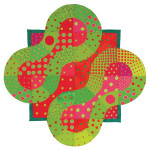
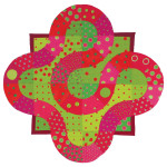
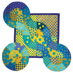
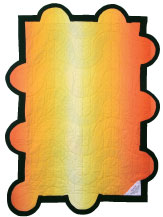
After “going to black” in the first four dot quilts, using primary colors plus black, I wondered if I could morph two colors together.
I started my experiment with a single piece of cerise and chartreuse fabric from a dot series designed by Jane Sassaman. I found only one other commercial fabric in that color combination, so I bought a selection of cerise or chartreuse fabrics, each with white dots. Then I colored the dots the opposite color with fabric markers. In addition, some dots are appliquéd or machine embroidered.
The quilt was nearly completed in 2003 when I was called away by other projects. When I was able to refocus on quilting in 2011, my mind was a frenzy of designs. However, my arthritis had advanced to where I could sew for only an hour or so a day and that with little pleasure due to pain. I decided to concentrate on the part of the process that only I could do, using skilled quilters to complete my quilts once I had cut the pieces and pinned them up on a design board.
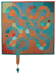
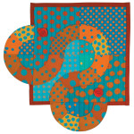
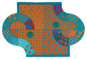
After completing the mini-series of four Convergence quilts, I had tons of cut components left over. I decided to use them to make “babies” of the Mother Quilts. Previously, in the already-completed Black Box series (see below), I had begun letting the wandering arcs escape the box on the sides and tops in addition to spilling out the bottom as in the earliest quilts. The eight small baby quilts are the culmination of that flight.
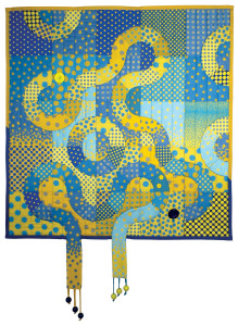
Jane Sassaman’s ombréd dots also inspired this color combo. And I also found commercial fabrics in blue with white dots and yellow with white dots, then filled in the dots with fabric markers in the opposing color. Still I did not have enough. Finally I decided to design additional dots and have them custom printed. Graphic artist Ann Marra turned my rough sketches of various dot configurations into formal jpgs, 4 different “fat quarters” to each yard, and I had them printed very economically by Spoonflower, an internet fabric house.
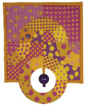
Again, with lots of leftover art parts from the construction of the “mother” quilt, I created two “babies.”
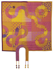
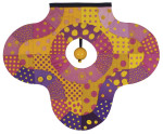
Another Jane Sassaman ombré dot color combination inspired this piece. And again, I needed to have my own custom dots printed by Spoonflower to fill out the few mauve and gold commercial dot fabrics I could find or create using fabric markers to color in the white dots on curry or mauve polka dot fabrics.
Alas, no Jane Sassaman dots were printed in these, my favorite colors, so I custom printed most of the fabrics. I had sought the rich, shimmery look of a fine Persian carpet, but the Spoonflower prints were flat and earthy when placed next to commercially dyed fabrics. I was very unhappy with the initial results, but improvised with some brighter solids and embellishment to try to enrich the look.
The Black Box Series
I had sent off all the Convergence quilts to be sewn by Dani and Katrina and was waiting for the first of them to start returning for embellishment. In this sudden lull after a tumult of creativity,
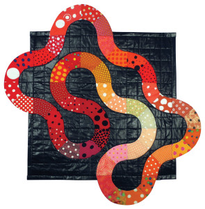
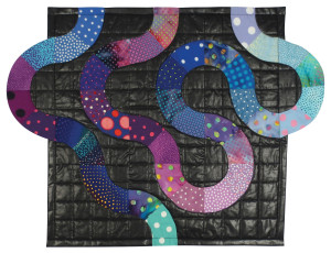
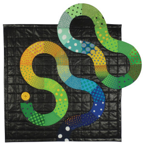
I spotted one of my favorite fabrics, a length of black polished cotton that I had bought 25 years ago when quilt artist Sonia Lee Barrington had a stash sale. (It’s not made anymore!) I began playing with the hundreds of dot fabrics I had collected and arranged in color-wheel order in plastic bins. The Black Box series was the result. They went together very quickly, less than a day for each from idea to all pinned up for sewing. I also began thinking “outside the box,” letting the wandering lines escape the frame of the quilt body on the sides and top as well as spilling out downward from the bottom as in earlier quilts. Buttons began to play a major rôle in putting the dot to the “question mark” hooks created by the spiraling arcs.
Celebration
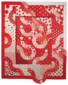
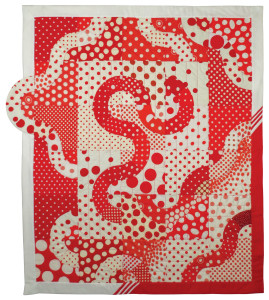
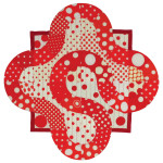
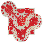
One day I discovered that I had accumulated two large boxes of red and white dots, some of them dumpster finds and castoffs from people knowing I was the “dot” person. These fabrics begged to become a pair of large quilts. For even more variety, I had Spoonflower print up my master dot patterns, recolored to red and white. Unfortunately, Spoonflower’s “red” appeared rust when next to bright, clear commercial reds. However, I did use some of these dull reds to provide more variety in the surface. Confetti leftovers produced the two small quilts called Streamers.
Hawaiian Side Trip
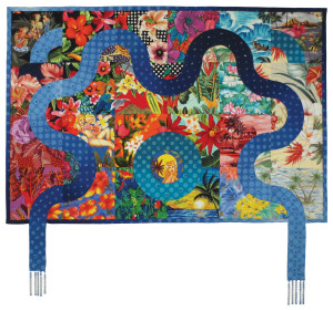
A diversion from all-dots. I have always adored Hawaiian prints and wanted to see if I could morph them into each other, with a sparkling river running through. I had nearly finished it in 2005 when I was distracted by other projects. I used $100 (!) in glass beads to simulate bubbles in the water’s path, with beaded fringes for waterfalls.
Elevation
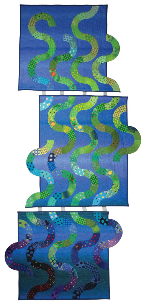
Kickoff of a new mini-series of dot quilts that are taller than wide to fill high spaces. Meander was first in the series to have a “virtual” block, that is, the background is solid, but the appliquéd arcs follow an invisible grid.
A triptych depicting seaweed rising from the bottom of the ocean reaching toward the sun. Cottons, polycottons. Seaweed also has a “virtual” block, a solid background with the appliquéd arcs following an invisible grid.
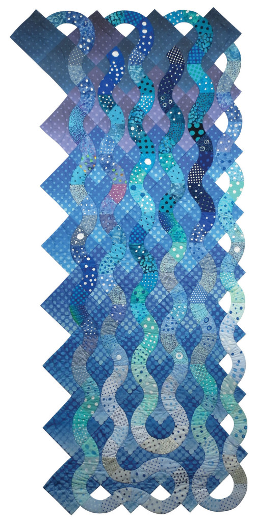
On-point blocks, the first time I have used this format in the polka dot series. The background is custom printed cotton. The water streams arc outside the body of the quilt as they descend in curls of spray, ending in writhing foam at the bottom.
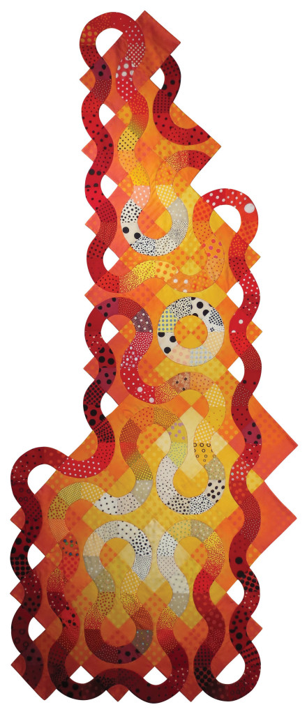
A companion piece to Waterfall, Bonfire was inspired by my daughter’s vivid description of a fall bonfire at Brown University where she was visiting with a friend. Waterfall is blue water descending; Bonfire is red flames rising. Both feature on-point blocks.
Besides dotted quilting fabrics, I’ve acquired polka dot plastic, chiffon, rubber, terrycloth, and lamé—even polka dot tissues—all of which may end up in a final, ultimate dot quilt. I see the series concluding like the magical hats in Dr. Seuss’s The Five Hundred Hats of Bartholomew Cubbins, each an advance on the previous one, growing more and more fabulous.
